Sunday, December 4, 2011

site specific; irvine spectrum


I found the Irvine Spectrum's holiday lights to be very effective. The lights of the Farris wheel along with the holiday lights were exciting and created a festive and inviting environment. It gave a small town feeling of warmth and community.

The lights in the in window of Urban Outfitters I found particularly inviting. They were using a playful idea of a clock and a countdown to Christmas. I was definitely drawn into the store by their use of lighting.

Week 10: A Fall day

One day last week, I was walking back to the arts department with some friends and we couldn't help but stop and admire the fallen leaves that were covering the ground. We were talking about how it feels like this year we are having more of a classic fall with the leaves changing and falling. It was a beautiful image with the coating of leaves and the filtered light coming through the trees, so as Jaque and Becca played in them, I snapped a photo. I love the light, playful feeling of the photo, and the warm light coming through the trees creates a wonderful world for them. I think this filter would work beautifully as a gobo for a stage performance to create a natural, outdoor feeling.

Week #10 - Site Specific

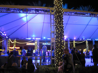
For my site specific blog, I chose to do the Irvine Spectrum. This space was awash with extravagant lights everywhere, from the bright and festive stores to the shining fountains and even an elaborately lit ice skating rink, shown in the first photograph. For me, the rink best gave an overall feeling for the site because, like the huge ferris wheel and carousel which were also bedecked with lights to attract the wandering teenagers. However, it was the only one of the three which was not moving, and thus enabled me to snap a picture without the lights blurring in my camera's lens.
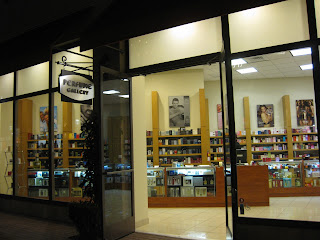
The lighting in the first shop I noticed was an abysmal failure. At first glance I mistook this perfumerie for a bookstore because of the lifeless, academic style of the lighting. Considering that the Perfume Gallery lacked any sort of window display, attractive pictures of bottles of perfume, or any other form of advertising beyond shelves and shelves of boxes that looked like nothing more books, I can see why there were no customers inside despite the otherwise bustling crowd of shoppers. The light was so bland and boring, especially compared with the garish finery surrounding the store, that I found my eyes automatically skipping over the front windows. I suspect that if the owners took the initiative to redesign the light to give the store a theme with a bit more mystery, passion, and romance, they would receive quite a bit more business.

Second I chose the Capital Seafood Bar for its unique and highly appropriate lighting. The soft glow of the red paper lanterns definitely added to the overall Asian theme of the restaurant, and also drew attention to the lovely intricate patterning of the architecture in the corners of the windows and door frames. The bright neon sign outside the front door was also red, matching the theme, and yet was tastefully highlighted with white shadowing, making the letters stand out clearly and legibly from a great distance. Finally, the interesting greenish-yellow luminescence around the alcoholic beverages behind the bar added an interesting exotic flavor to the unusual drinks they were serving. All in all, I thought the lighting for this restaurant was the most detailed and effective for the kind of message they were sending.

Week 10: SITE SPECIFIC


For my site specific blog, I decided to review the Irvine Spectrum. A native of Irvine, the Spectrum is a great place to shop, eat and yes, enjoy lights. Often my boyfriend and I would come here just to walk around because of the variety of shops and many things to do on a Wednesday evening. This picture of the carousel is a highlight of the center due to its positioning in the space and dramatic saturated lighting. With the beautiful waterfalls nearby the carousel, it helps creates a peaceful scene.


Being one of many poor lit stores, the Perfume Gallery had very poor lighting. With its overly cluttered selection of perfume, the lighting hardly helps draw attention to their store. Hopefully the perfume can sell itself. The yellow tinted shelving units and paint do not reflect the light. The squared florescent lights cause the customer to be overwhelmed with the unfocused scattered light. Perhaps if the items were lit with track lighting, the customer would be able to focus their eye on particular key fragrances. Having never seen too many shoppers inside, lighting would hopefully draw more in.


One of many stores that had great lighting was Urban Outfitters. Approximately once a month, Urban Outfitters redesigns their front marque with a catchy artistic look. What I also like about their store are the two panels of cracked glass that frame their doors entrance giving the glass a warm frosted look. Framing their doors entirely are two rather warm lights that help accent the building. Inside the store their ceiling are noticeably white, helping reflect the rather raw/bare look of the store. With the hanging florescent lights, it allows the light to reflect more to the floor than ceiling and allows the customer to be directed with an artistic look.