Sunday, November 27, 2011

week 9. red light


I noticed this light while walking down the street. The color red says many things to us such as, stop, danger, beware. It also can read as passion or love. It all depends on the context. I think it depends on the way it is presented to the interpreter. If it is in your face it reads as danger. That is the way that this light read to me. Stop. Danger.

Week 9: Site Specific Blog


For my site specific blog, I visited The Irvine Spectrum. As I walked around the mall by myself this evening, I couldn't help but feel small within the huge landscape of stores, restaurants, and people. In general, I'm not a huge fanof malls, and the Spectrum feels especially over-decorated and grand. The lighting is no different,with strands of light covering the trees and draping across walkways, and fluorescent signs in various places; however, this photo shows one aspect of the overall lighting that I did appreciate and find effective. While the general lighting was cooler white lights that led to a more cold, disconnected feeling, these lamps with their warm projected light created a more welcoming, close feeling within the expansive mall.

The first store that I took a photo of is Hollister. I have never quite understood the lighting in Hollister--it is so dark that you can't even see the clothes! In this photo, you can see the entrance to the store, which doesn't feel very welcoming. Rather, it feels as if you are about to walk into a cave. I can understand their wish to create maybe a "cool" or relaxed atmosphere for teenagers, but at the same time, I think they go overboard by having such dim lighting. The same effect could be created by having sparse low intensity warm lighting, as opposed to having a literally dark store. The way that their lighting is now makes me not want to enter the store.


The second store that I visited was Tommy Bahamas. Overall, I feel like the lighting in this store was very successful. They incorporated a variety of warm white lights in the form of bulbs lining the windows, and lamps on the walls lighting the clothing. They also created a general warm and welcoming feeling with their warm overhead lighting throughout the space. The lighting also added to the sophisticated, yet relaxed feel of the Tommy Bahama clothing and set up of the store. It almost felt like sunlight was pouring into the store (even though it was dark and cold outside) while I was surrounded by Hawaiian print shirts and casual men's clothes. I think this store, while it is targeting a different crowd than Hollister, goes to show that a relaxed, "cool" environment can be created with warm, bright lights, as opposed to a dark lack of lighting.


Week #9 - Lights and Symbols

This week I noticed the first of the Christmas decorations going up, even before it was Thanksgiving. At first I had my standard dismay at the way Christmas seems to come earlier every year, and then I realized with interest what a perfect example these lights were of using light as a symbol. I knew immediately when I looked at this shape of light that it was meant to be a Christmas tree, even though it was blue (not a Christmas color) and had no colored balls etc adorning it. In fact, it didn't even attempt to mimic the shape of branches; it was just a simple blue cone. This made me think of how much light can hint at or suggest certain ideas, without having to spell them out explicitly. As the viewer, we make the jump and our minds fill in the details to match what we expect to see from our association of the light we see and the ideas/feelings we attach to it. This idea will be useful in my own lighting designs, in that we can give them impression of a forest etc. with lighting by capturing the main points in light; we don't necessarily have to worry as much about every little detail as much as the overall feeling we are conveying. I really enjoyed the exploration I got to do with the light gloves in the dance piece I choreographed for Katy to design this week, and will have to think more about light's potential for use as symbols in my future work.

WEEK 9: NATURE'S VERSION OF BUBBLE WRAP


On Thanksgiving Eve, my boyfriend, Marcos and I decided to go for a walk in the park before his flight home to San Martin. As the breeze blew through the trees, it flew many leaves into the air as if they were magic hang gliders; leaving several trees leafless. As we walked, I began to listen to the crunchy noise the dry leaves made beneath our feet. It was if the leaves were nature's version of bubble wrap. I took this picture at first as a memory of the day, but as I uploaded this picture I was excited how the shadow and light drew my sight in. With the warm morning golden light, the leaves look saturated in some areas with orange and auburn tones, while other parts are in shadow with dark crisp brown and reds as they overlap. The light adds a highlight around the edges of the leaves and creates a beautiful shadow upon his shoe making the colors pop. Marcos' shoes add an interesting texture and layer to the leaves that lay beneath his feet. His shoes add nor take away from the beautiful atmosphere and light of the park but show character with his one rolled up pant leg.

Sunday, November 20, 2011

Candlelit Dinner


A few weeks ago, on a relatively warm night, a few friends and I decided to cook dinner and eat outside on our patio. We lit the candle inside this lantern before it got dark, and as the sun went down, admired how beautiful it was. I love how when light is in a closed, but transparent space like this candle within the lantern, there is a feeling of it both being expansive and contained. It feels as if the light is illuminating the space within the lantern, while at the same time providing light and warmth to a larger space. I find the shadows created in this photo to be very interesting, and the way in which the light passes through the star cut outs in the top of the lantern catches my eye. I think this photo also accurately depicts the overall feeling of the moment--warmth in spending time with friends.

Week #8 - Reflections

This week I have been finalizing the choreography for my second lighting project, and for this have been exploring the different possibilities afforded me by using gloves with lights in the fingers. I discovered by accident that one of my favorite effects involved the ability of the colored light to reflect off the marley floor, creating beautiful pools of light that could highlight the small, subtle movements of my dancers' hands in their close floor work. A few days later, as I was driving home, I noticed that the stoplights at each intersection were creating the same sort of lovely reflections on the wet ground of the street. I hadn't really noticed them earlier in the day when the sun was brighter, so this tells me that I will have to have a very dark environment in the floor work section of my dance in order for the reflections on the ground to show up nicely. I also saw that the colored light appeared to show up a lot better than the plain white light, but this might be because of the phenomenon we talked about in class, whereby our eye is immediately drawn to the color of light we perceive as the "warmest."

week 8. off the street


It is a rainy Sunday afternoon/evening. I am walking to the grocery store when I notice the headlights of the cars passing me. Well what I really noticed wad the way that the lights were being reflected off of the street. There was a great deal of light being bounced off the black street. It is something that I have seen may times but never really paid attention to before.

WEEK 8: FILTERED LIGHT

On Monday I had come across a forest green soda bottle on a bench at UCI. At first I was drawn to the bottle from a distance and how the light came through. Walking closer I saw a reflected shadow with a glowing colored beam radiating on the cemented bench. I had instantly thought of our beginning weeks of class when I had learned about colored theatrical lighting in the 16th century with a barber basin and a bottle as a lens. This bottle reminded me of how bottles were used to light objects and how technology has transitioned from gelatin to gels. Although this technology is no longer used for stage or lighting, I feel the reflected light can create a sense of warmth with its high contrast gobo like pattern. With the sun shining through the bottle I am able to see the refraction come from behind the bottle to create high contrast pattern. Since the bottle is empty I can clearly see the edges and outline of the bottle; creating an artistic design.

Sunday, November 13, 2011

Week 7: The Sky!

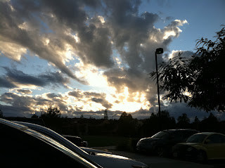
This week, I found myself constantly in awe of the beauty of the sky. For some reason, I felt like the sky was especially stunning, and was struck by it at all times of day-- morning, afternoon, and evening. In fact, it was hard for me to choose just one of the photos to show here! This photo was taken from the parking lot of the ARC. I had just come out of the gym and gotten in my car when I noticed how gorgeous the sky was. I couldn't help but snap a photo, and I am so glad I did. It is skies like this that make me feel as if the heaven's are shining down from above. The contrast of the dark underside of the clouds with the bright light shining through creates a dramatic image and feels to me as if something is trying to break through the clouds and descend on us. I also love the contrast between the shadowed dark trees and cars and the light blue sky, bright light, and clouds. Overall, I just love the overwhelming power of the sky, and the sense of mystery, hope, and radiance that this specific moment holds.

WEEK 7: KONA


This is Kona. This week Kona turned three years old. As a baby she was rescued from a cardboard box in the middle of the street. My boyfriend’s roommate at the time went off to train as a US Coast Guard and left my boyfriend in custody with Kona. Never having a cat before my boyfriend and I quickly discovered her playful and energetic ways from the very beginning. If its a cat toy, she wont play with it. Kona always plays with unexpected things. This picture in particular I took while we were playing in her carpeted tower. As she looked up to chase the shoelace I was able to capture her focus. Anytime Kona is in focus mode her pupils get rather large and lose their green marbled look. What I like about this picture is how the light was captured on the left and her batman shadow is captured just above. Although the eye is drawn to the bright areas of the photo, the interplay between bright and dark, highlight and shadow are seen. Since the flash focused the light mainly on the pale background to the left, it allows the viewer to pick up the texture of her tiny hairs and intent expression. When I look at this photo it makes me think that Kona is playing a game of “peek-a-boo.” Kona’s head just peeking within the frame shows her playful and curious nature.

Saturday, November 12, 2011

Week #7 - Functional or Ornamental?

This week I'm thinking about functionality versus ornamentation in lighting. It seems that one reason I haven't been drawn to a great many examples of artificial lighting is that much of the light I see in everyday life is designed primarily to be functional. We naturally like to look at "pretty" light because as choreographers we enjoy light which makes our dancers look good. However, there is a fine balance to be struck when we design the light for our pieces between the functionality of the light (does it illuminate the form sufficiently to see the movement, does it convey the meaning of the piece, etc) and do we "like" it. I want to get away from the need to always try and make my dancers look pretty, especially when another approach might better serve the needs of my piece. As I was walking to my car, my attention was caught by this lovely glowing orb of light rising up above the treetops. Unlike most streetlamps, the light from this one shone bright and clear, and seemed to shed most of its illumination on the leaves and branches below it, highlighting the beauty of the foliage. While I assume this light was made in order to serve a specific purpose like that of an ordinary streetlamp, I couldn't help but appreciate the attractiveness of the setup. I hope to strike such an admirable balance between functionality and aesthetics in my own future designs.

Monday, November 7, 2011

week 6. light reflected


It was Saturday afternoon and I was walk along the beach in Laguna. The sun was so bright and sky blue and clear. The rain from the day before had made this day almost magical. There was a cool breeze in the air and the warmth of the sun on my face. The light from the sun reflecting off of the ocean was almost blinding. Yet it was truly beautiful.

Sunday, November 6, 2011

Week #6 - Natural vs Artificial

I've realized that the vast majority of the time I take the time to notice light in the world around me, it is some form of natural light. The sun, in all its various manifestations, continually dazzles me with its beauty. Therefore, this week I was resolutely determined to find lighting which I considered striking that originated from an artificial source. While I can readily appreciate sunlight's immense capacity for warmth and power, I am attracted by the possibilities related to angle of light that can be afforded me by placing a lamp in unorthodox places around the dancer. When walking past this stairway in the early evening, I was amazing by the way that the uncovered light shining by the doorway directly below me could create such a fascinating and inviting glow around the steps and railings. I felt the instinctive desire to place dancers in that lovely welcoming radiance, and wondered if it would be possible to recreate a similar effect on stage.

Week 6: A walk with friends

Last year, on a warm day during winter quarter, a few of my friends and I decided to take a walk down University and watch the sunset. We noticed that the sunset and bay provided a beautiful backdrop for some photos. So, being dancers, we naturally decided to do the classic "jump up and strike a pose" shot. I love this photo because it captures a sense of movement, and also creates a feeling of vastness with the background of sky and water behind us. I also enjoy the contrast created between the black of our silhouettes against the oranges and blues of the sky. I think this photo has a lot of potential to be inspiration for a lighting design. I always enjoy the use of silhouettes in dance pieces, and think that there are times when it is a very successful choice for the mood of a work.

WEEK 6: Santa Monica Pier

On Saturday around five o’clock I met a friend at the Santa Monica Pier. The ocean breeze cooled down the surrounding air. Having never been to the pier, I took many photographs. As I crossed the street with my friend, I quickly snapped this pictured of the Santa Monica Pier. I am really excited and amazed that I was able to capture this image as I anticipated my picture to be blurry. The gloomy weather captured the vibrant yellow and muted all competing colors. Although this effect can be created in photoshop, the overcast conditions created this effect naturally. The position of the sign, helps to create a frame within a frame that draws the viewers attention to the bright yellow taxis.