Sunday, December 4, 2011

site specific; irvine spectrum


I found the Irvine Spectrum's holiday lights to be very effective. The lights of the Farris wheel along with the holiday lights were exciting and created a festive and inviting environment. It gave a small town feeling of warmth and community.

The lights in the in window of Urban Outfitters I found particularly inviting. They were using a playful idea of a clock and a countdown to Christmas. I was definitely drawn into the store by their use of lighting.

Week 10: A Fall day

One day last week, I was walking back to the arts department with some friends and we couldn't help but stop and admire the fallen leaves that were covering the ground. We were talking about how it feels like this year we are having more of a classic fall with the leaves changing and falling. It was a beautiful image with the coating of leaves and the filtered light coming through the trees, so as Jaque and Becca played in them, I snapped a photo. I love the light, playful feeling of the photo, and the warm light coming through the trees creates a wonderful world for them. I think this filter would work beautifully as a gobo for a stage performance to create a natural, outdoor feeling.

Week #10 - Site Specific

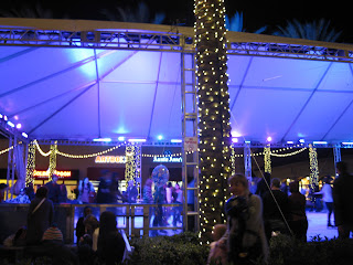
For my site specific blog, I chose to do the Irvine Spectrum. This space was awash with extravagant lights everywhere, from the bright and festive stores to the shining fountains and even an elaborately lit ice skating rink, shown in the first photograph. For me, the rink best gave an overall feeling for the site because, like the huge ferris wheel and carousel which were also bedecked with lights to attract the wandering teenagers. However, it was the only one of the three which was not moving, and thus enabled me to snap a picture without the lights blurring in my camera's lens.

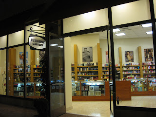
The lighting in the first shop I noticed was an abysmal failure. At first glance I mistook this perfumerie for a bookstore because of the lifeless, academic style of the lighting. Considering that the Perfume Gallery lacked any sort of window display, attractive pictures of bottles of perfume, or any other form of advertising beyond shelves and shelves of boxes that looked like nothing more books, I can see why there were no customers inside despite the otherwise bustling crowd of shoppers. The light was so bland and boring, especially compared with the garish finery surrounding the store, that I found my eyes automatically skipping over the front windows. I suspect that if the owners took the initiative to redesign the light to give the store a theme with a bit more mystery, passion, and romance, they would receive quite a bit more business.

Second I chose the Capital Seafood Bar for its unique and highly appropriate lighting. The soft glow of the red paper lanterns definitely added to the overall Asian theme of the restaurant, and also drew attention to the lovely intricate patterning of the architecture in the corners of the windows and door frames. The bright neon sign outside the front door was also red, matching the theme, and yet was tastefully highlighted with white shadowing, making the letters stand out clearly and legibly from a great distance. Finally, the interesting greenish-yellow luminescence around the alcoholic beverages behind the bar added an interesting exotic flavor to the unusual drinks they were serving. All in all, I thought the lighting for this restaurant was the most detailed and effective for the kind of message they were sending.

Week 10: SITE SPECIFIC


For my site specific blog, I decided to review the Irvine Spectrum. A native of Irvine, the Spectrum is a great place to shop, eat and yes, enjoy lights. Often my boyfriend and I would come here just to walk around because of the variety of shops and many things to do on a Wednesday evening. This picture of the carousel is a highlight of the center due to its positioning in the space and dramatic saturated lighting. With the beautiful waterfalls nearby the carousel, it helps creates a peaceful scene.


Being one of many poor lit stores, the Perfume Gallery had very poor lighting. With its overly cluttered selection of perfume, the lighting hardly helps draw attention to their store. Hopefully the perfume can sell itself. The yellow tinted shelving units and paint do not reflect the light. The squared florescent lights cause the customer to be overwhelmed with the unfocused scattered light. Perhaps if the items were lit with track lighting, the customer would be able to focus their eye on particular key fragrances. Having never seen too many shoppers inside, lighting would hopefully draw more in.


One of many stores that had great lighting was Urban Outfitters. Approximately once a month, Urban Outfitters redesigns their front marque with a catchy artistic look. What I also like about their store are the two panels of cracked glass that frame their doors entrance giving the glass a warm frosted look. Framing their doors entirely are two rather warm lights that help accent the building. Inside the store their ceiling are noticeably white, helping reflect the rather raw/bare look of the store. With the hanging florescent lights, it allows the light to reflect more to the floor than ceiling and allows the customer to be directed with an artistic look.


Sunday, November 27, 2011

week 9. red light


I noticed this light while walking down the street. The color red says many things to us such as, stop, danger, beware. It also can read as passion or love. It all depends on the context. I think it depends on the way it is presented to the interpreter. If it is in your face it reads as danger. That is the way that this light read to me. Stop. Danger.

Week 9: Site Specific Blog


For my site specific blog, I visited The Irvine Spectrum. As I walked around the mall by myself this evening, I couldn't help but feel small within the huge landscape of stores, restaurants, and people. In general, I'm not a huge fanof malls, and the Spectrum feels especially over-decorated and grand. The lighting is no different,with strands of light covering the trees and draping across walkways, and fluorescent signs in various places; however, this photo shows one aspect of the overall lighting that I did appreciate and find effective. While the general lighting was cooler white lights that led to a more cold, disconnected feeling, these lamps with their warm projected light created a more welcoming, close feeling within the expansive mall.

The first store that I took a photo of is Hollister. I have never quite understood the lighting in Hollister--it is so dark that you can't even see the clothes! In this photo, you can see the entrance to the store, which doesn't feel very welcoming. Rather, it feels as if you are about to walk into a cave. I can understand their wish to create maybe a "cool" or relaxed atmosphere for teenagers, but at the same time, I think they go overboard by having such dim lighting. The same effect could be created by having sparse low intensity warm lighting, as opposed to having a literally dark store. The way that their lighting is now makes me not want to enter the store.


The second store that I visited was Tommy Bahamas. Overall, I feel like the lighting in this store was very successful. They incorporated a variety of warm white lights in the form of bulbs lining the windows, and lamps on the walls lighting the clothing. They also created a general warm and welcoming feeling with their warm overhead lighting throughout the space. The lighting also added to the sophisticated, yet relaxed feel of the Tommy Bahama clothing and set up of the store. It almost felt like sunlight was pouring into the store (even though it was dark and cold outside) while I was surrounded by Hawaiian print shirts and casual men's clothes. I think this store, while it is targeting a different crowd than Hollister, goes to show that a relaxed, "cool" environment can be created with warm, bright lights, as opposed to a dark lack of lighting.


Week #9 - Lights and Symbols

This week I noticed the first of the Christmas decorations going up, even before it was Thanksgiving. At first I had my standard dismay at the way Christmas seems to come earlier every year, and then I realized with interest what a perfect example these lights were of using light as a symbol. I knew immediately when I looked at this shape of light that it was meant to be a Christmas tree, even though it was blue (not a Christmas color) and had no colored balls etc adorning it. In fact, it didn't even attempt to mimic the shape of branches; it was just a simple blue cone. This made me think of how much light can hint at or suggest certain ideas, without having to spell them out explicitly. As the viewer, we make the jump and our minds fill in the details to match what we expect to see from our association of the light we see and the ideas/feelings we attach to it. This idea will be useful in my own lighting designs, in that we can give them impression of a forest etc. with lighting by capturing the main points in light; we don't necessarily have to worry as much about every little detail as much as the overall feeling we are conveying. I really enjoyed the exploration I got to do with the light gloves in the dance piece I choreographed for Katy to design this week, and will have to think more about light's potential for use as symbols in my future work.

WEEK 9: NATURE'S VERSION OF BUBBLE WRAP


On Thanksgiving Eve, my boyfriend, Marcos and I decided to go for a walk in the park before his flight home to San Martin. As the breeze blew through the trees, it flew many leaves into the air as if they were magic hang gliders; leaving several trees leafless. As we walked, I began to listen to the crunchy noise the dry leaves made beneath our feet. It was if the leaves were nature's version of bubble wrap. I took this picture at first as a memory of the day, but as I uploaded this picture I was excited how the shadow and light drew my sight in. With the warm morning golden light, the leaves look saturated in some areas with orange and auburn tones, while other parts are in shadow with dark crisp brown and reds as they overlap. The light adds a highlight around the edges of the leaves and creates a beautiful shadow upon his shoe making the colors pop. Marcos' shoes add an interesting texture and layer to the leaves that lay beneath his feet. His shoes add nor take away from the beautiful atmosphere and light of the park but show character with his one rolled up pant leg.

Sunday, November 20, 2011

Candlelit Dinner


A few weeks ago, on a relatively warm night, a few friends and I decided to cook dinner and eat outside on our patio. We lit the candle inside this lantern before it got dark, and as the sun went down, admired how beautiful it was. I love how when light is in a closed, but transparent space like this candle within the lantern, there is a feeling of it both being expansive and contained. It feels as if the light is illuminating the space within the lantern, while at the same time providing light and warmth to a larger space. I find the shadows created in this photo to be very interesting, and the way in which the light passes through the star cut outs in the top of the lantern catches my eye. I think this photo also accurately depicts the overall feeling of the moment--warmth in spending time with friends.

Week #8 - Reflections

This week I have been finalizing the choreography for my second lighting project, and for this have been exploring the different possibilities afforded me by using gloves with lights in the fingers. I discovered by accident that one of my favorite effects involved the ability of the colored light to reflect off the marley floor, creating beautiful pools of light that could highlight the small, subtle movements of my dancers' hands in their close floor work. A few days later, as I was driving home, I noticed that the stoplights at each intersection were creating the same sort of lovely reflections on the wet ground of the street. I hadn't really noticed them earlier in the day when the sun was brighter, so this tells me that I will have to have a very dark environment in the floor work section of my dance in order for the reflections on the ground to show up nicely. I also saw that the colored light appeared to show up a lot better than the plain white light, but this might be because of the phenomenon we talked about in class, whereby our eye is immediately drawn to the color of light we perceive as the "warmest."

week 8. off the street


It is a rainy Sunday afternoon/evening. I am walking to the grocery store when I notice the headlights of the cars passing me. Well what I really noticed wad the way that the lights were being reflected off of the street. There was a great deal of light being bounced off the black street. It is something that I have seen may times but never really paid attention to before.

WEEK 8: FILTERED LIGHT

On Monday I had come across a forest green soda bottle on a bench at UCI. At first I was drawn to the bottle from a distance and how the light came through. Walking closer I saw a reflected shadow with a glowing colored beam radiating on the cemented bench. I had instantly thought of our beginning weeks of class when I had learned about colored theatrical lighting in the 16th century with a barber basin and a bottle as a lens. This bottle reminded me of how bottles were used to light objects and how technology has transitioned from gelatin to gels. Although this technology is no longer used for stage or lighting, I feel the reflected light can create a sense of warmth with its high contrast gobo like pattern. With the sun shining through the bottle I am able to see the refraction come from behind the bottle to create high contrast pattern. Since the bottle is empty I can clearly see the edges and outline of the bottle; creating an artistic design.

Sunday, November 13, 2011

Week 7: The Sky!

This week, I found myself constantly in awe of the beauty of the sky. For some reason, I felt like the sky was especially stunning, and was struck by it at all times of day-- morning, afternoon, and evening. In fact, it was hard for me to choose just one of the photos to show here! This photo was taken from the parking lot of the ARC. I had just come out of the gym and gotten in my car when I noticed how gorgeous the sky was. I couldn't help but snap a photo, and I am so glad I did. It is skies like this that make me feel as if the heaven's are shining down from above. The contrast of the dark underside of the clouds with the bright light shining through creates a dramatic image and feels to me as if something is trying to break through the clouds and descend on us. I also love the contrast between the shadowed dark trees and cars and the light blue sky, bright light, and clouds. Overall, I just love the overwhelming power of the sky, and the sense of mystery, hope, and radiance that this specific moment holds.

WEEK 7: KONA


This is Kona. This week Kona turned three years old. As a baby she was rescued from a cardboard box in the middle of the street. My boyfriend’s roommate at the time went off to train as a US Coast Guard and left my boyfriend in custody with Kona. Never having a cat before my boyfriend and I quickly discovered her playful and energetic ways from the very beginning. If its a cat toy, she wont play with it. Kona always plays with unexpected things. This picture in particular I took while we were playing in her carpeted tower. As she looked up to chase the shoelace I was able to capture her focus. Anytime Kona is in focus mode her pupils get rather large and lose their green marbled look. What I like about this picture is how the light was captured on the left and her batman shadow is captured just above. Although the eye is drawn to the bright areas of the photo, the interplay between bright and dark, highlight and shadow are seen. Since the flash focused the light mainly on the pale background to the left, it allows the viewer to pick up the texture of her tiny hairs and intent expression. When I look at this photo it makes me think that Kona is playing a game of “peek-a-boo.” Kona’s head just peeking within the frame shows her playful and curious nature.

Saturday, November 12, 2011

Week #7 - Functional or Ornamental?

This week I'm thinking about functionality versus ornamentation in lighting. It seems that one reason I haven't been drawn to a great many examples of artificial lighting is that much of the light I see in everyday life is designed primarily to be functional. We naturally like to look at "pretty" light because as choreographers we enjoy light which makes our dancers look good. However, there is a fine balance to be struck when we design the light for our pieces between the functionality of the light (does it illuminate the form sufficiently to see the movement, does it convey the meaning of the piece, etc) and do we "like" it. I want to get away from the need to always try and make my dancers look pretty, especially when another approach might better serve the needs of my piece. As I was walking to my car, my attention was caught by this lovely glowing orb of light rising up above the treetops. Unlike most streetlamps, the light from this one shone bright and clear, and seemed to shed most of its illumination on the leaves and branches below it, highlighting the beauty of the foliage. While I assume this light was made in order to serve a specific purpose like that of an ordinary streetlamp, I couldn't help but appreciate the attractiveness of the setup. I hope to strike such an admirable balance between functionality and aesthetics in my own future designs.

Monday, November 7, 2011

week 6. light reflected


It was Saturday afternoon and I was walk along the beach in Laguna. The sun was so bright and sky blue and clear. The rain from the day before had made this day almost magical. There was a cool breeze in the air and the warmth of the sun on my face. The light from the sun reflecting off of the ocean was almost blinding. Yet it was truly beautiful.

Sunday, November 6, 2011

Week #6 - Natural vs Artificial

I've realized that the vast majority of the time I take the time to notice light in the world around me, it is some form of natural light. The sun, in all its various manifestations, continually dazzles me with its beauty. Therefore, this week I was resolutely determined to find lighting which I considered striking that originated from an artificial source. While I can readily appreciate sunlight's immense capacity for warmth and power, I am attracted by the possibilities related to angle of light that can be afforded me by placing a lamp in unorthodox places around the dancer. When walking past this stairway in the early evening, I was amazing by the way that the uncovered light shining by the doorway directly below me could create such a fascinating and inviting glow around the steps and railings. I felt the instinctive desire to place dancers in that lovely welcoming radiance, and wondered if it would be possible to recreate a similar effect on stage.

Week 6: A walk with friends

Last year, on a warm day during winter quarter, a few of my friends and I decided to take a walk down University and watch the sunset. We noticed that the sunset and bay provided a beautiful backdrop for some photos. So, being dancers, we naturally decided to do the classic "jump up and strike a pose" shot. I love this photo because it captures a sense of movement, and also creates a feeling of vastness with the background of sky and water behind us. I also enjoy the contrast created between the black of our silhouettes against the oranges and blues of the sky. I think this photo has a lot of potential to be inspiration for a lighting design. I always enjoy the use of silhouettes in dance pieces, and think that there are times when it is a very successful choice for the mood of a work.

WEEK 6: Santa Monica Pier

On Saturday around five o’clock I met a friend at the Santa Monica Pier. The ocean breeze cooled down the surrounding air. Having never been to the pier, I took many photographs. As I crossed the street with my friend, I quickly snapped this pictured of the Santa Monica Pier. I am really excited and amazed that I was able to capture this image as I anticipated my picture to be blurry. The gloomy weather captured the vibrant yellow and muted all competing colors. Although this effect can be created in photoshop, the overcast conditions created this effect naturally. The position of the sign, helps to create a frame within a frame that draws the viewers attention to the bright yellow taxis.

Sunday, October 30, 2011

Week 5: Peering In

A couple of weeks ago, I was on a walk with my roommates along the beach, and on our way back home, I was very interested in this porch light. I love the way that it feels contained in the space, yet the photo is able to create a sense of peering into it, creating a sort of haunting feeling. With the wrought iron in the foreground, the light appears small in the background, yet still has a strong presence in the photo. The feeling that I get from this photo is haunting, yet still warm and safe, like home.
This photo was taken in this fabulous sculpture garden at the Indianapolis Museum of Art. It was a perfect, sunny day and we walked through this installation tunnel into a secret courtyard... so cool. I loved how this tunnel felt like the entrance to a military bunker, with the concrete walls and rocks held up by chicken wire, but it led to an oasis. It reflects the journey my husband and I have been on, where we've had to trust one another as we've walked rather blindly through some major life changes. Sometimes the people you think you know well will surprise you under new conditions with a whole other side of themselves. I've been lucky - the surprises I've gotten from Ryan have been good ones overall, but I am also reminded that we both need space to redefine, reconsider, and grow.

Week 5 Sunset


This week I tried to capture a sunset. This proved to be more difficult than I had expected. Each picture I took failed to capture the moment properly. The colors were intense one evening and I was able to get this picture. The purples, pinks and blues were beautiful. It evoked a feeling of peace and serenity. There was a breeze and and a bit of heat left from the sun in the air. The clouds looked as if they had been placed in each spot on purpose.

Week #5 - Dappling of Leaves

This week I've been thinking about the kind of light I wanted to design for McCree's choreography. Since I want to create the feeling of a predator in the wild, I've been looking for ways to convey the impression of leaves on the ground. To this end, I'm thinking of using gobos to project the image of leaves onto the ground. Ironically, right before my meeting with McCree this week I was so struck by the lovely dappled pattern of sunlight filtering through leaves outside the dance loft that I felt compelled to climb out onto a ledge out over the staircase to snap a picture of it. Even though the shapes of the shadows don't really seem to resemble leaves, the overall look is clearly that of foliage. It inspires me to play with subtlety in my work, rather than just focusing on the most obviously prominent characteristics of my design.

Saturday, October 29, 2011

WEEK 5: Sunset, Sunrise

On a late Wednesday afternoon on Balboa Island’s ferry, the sun began to set. I took out my camera and began to snap some pictures. What is powerful about this particular picture are the casts of shadows and light. The fire colored sky blends together in sequences of reds, oranges and yellows. The brightness of the light creates a sharp outline around the boat and trees. The position of the sun makes it difficult for the viewer to know whether or not it is sunrise or sunset. Colors of the sunset divide the picture into three distinct parts: the glowing sky, the deep shadows and the reflective waters. The warmth of the picture captivates the viewers eye and creates a wonderful fall memory for me.

Sunday, October 23, 2011

week 4. colors of the sky

I used this opportunity to look for the colors in the sky other than blue. I was surprised to see how much violet I was able to notice in the sky. There were layers of color in the sky that I had never really noticed before. There were pinks and blue and lavenders. There was a feeling of calm and peace in the air. It was truly a beautiful backdrop.

Week #4 - Brilliant Beams

This week I've been thinking about the way in which the shape and structure of light can affect the feeling it engenders. I had previously thought mostly about intensity and color to create emotion, but in our improv lighting experiments I noticed the way that the impact of the design was highly dependent upon the shape of the light. We don't have to use gobos to play with shape in lighting. The difference between using of a wide wash or a confined spot of light can make all the difference in a design. My personal favorite technique that I've seen thus far in the class is using a single shin far downstage or upstage to create a sharp, angled beam of light. When I saw the way in which the sunlight was creating streaks in the sky as it passed through the clouds, it reminded me strongly of the effect I had so appreciated with the shin. I was so excited to snap a picture of it which actually captured the beauty of the moment! I think that I am drawn to the idea of having a clear source of light, and then playing with the gradations of light and shadow which result.

WeeK 4: Silhouette

On late Friday afternoon, I headed out to Huntington Beach. Sitting on the sand near the water, I instantly became hypnotized with the the sound of the waves and the sunlight hitting the water. While I sat there shooting pictures to capture the saturation of light on the water, a man with a skim board came into frame. As the waves rolled in, he stood there waiting for the perfect wave to skim. With the sun in front of me, it allowed me to capture his silhouette against the warmth of the sun reflected into the ocean. His silhouette gives mystery to his identity. The position of the skim boarder, that stood far from any distinguishable landmarks, leaves the viewer to be drawn into a wide open space. This picture shows a good example of dark and light in balance. The oceans power and the sunlight hitting the waves creates a sense of calmness to the atmosphere in the picture.

Saturday, October 22, 2011

Week 4: visit from a friend : )

A few weeks ago, my friend Kellie came to visit for the weekend before she moved to Chicago. Me, Kellie, and my roommate Becca decided to go to the Balboa Pier and walk around, get some cotton candy, and just hang out. We walked down to a grassy area and came upon a tree perfect for climbing. So of course, Kellie and Becca jumped right on it and quickly found that it was easier to climb up than it was to get down. I snapped this photo just as Kellie had climbed up, and noticed right away that the lighting was beautiful in it. While it was an overcast day, no spectacular sunlight or anything, the way that the light filtered through the leaves was beautiful. In this photo, I love the sense of foreground and background that is created. I feel like Kellie really pops out from the background, creating a sort of three-dimensional feel.

Sunday, October 16, 2011

week 3. path


On Sunday evening I set out to be inspired by light. I was walking around campus looking at light in a different way. I was drawn to this path of light in the park. I am not sure the picture captures the moment as I experienced it but it does represent the sense of mystery I saw. The lamps offered a soft glow leading in different in different directions. The sunset created a beautiful sky backdrop of lavender and blue.

Week #3 - Misty Mornings

When looking through my swatch book this week to light our last blog project, I was fascinated by the idea that there is no such thing as gray light. I studied clouds in the sky every time I was outside, and (although I saw endless white clouds) I couldn't seem to spot a gray one. They always ended up being lavender as Lonnie had suggested, or some variation of another color. Then, on my daily morning commute, my car was suddenly enveloped in fog. I had always thought of fog as being gray, but when I took at good look at the fog bank from a distance it resembled nothing more that a cloud on the ground. When driving through it I realized why I had envisioned the light inside fog as being gray. The water vapor in the air is so thick that it blocks out a great deal of the light passing through it, bringing down the overall intensity of the light dramatically. Even though the sun was bright outside the fog, all the colors were very muted when looking through the mist. It occurred to me that maybe that works in a similar way to the materials in the very back of the swatch book, since they are also made of thicker materials that won't let as much light through.

Week 3: A Distant Memory

This is a photo that I took last spring quarter when I was on a walk with a few of my close friends. One of my friends was dog sitting for somebody, so we all decided to come over and take the dog for a walk. We came upon this tunnel, and I was immediately drawn to the lighting. In fact, at that time my roommate Rachel was taking lighting with Lonnie, and I immediately sent her some photos for her to potentially use in her lighting blog! Now, months later, I still thought of this photo as one that I appreciate the lighting in. There is something I love about the warm quality of the light as it spills out of the tunnel, and the contrast of it against the dark blanket of the night. This photo not only reminds me of fond memories with my friends; I feel that it also has the potential to inspire a piece of choreography or lighting. When I look at it, I can hear music that could be a part of the moment, and can see movement that belongs within the mood of the photo.

Week 3: The Nature Show


One balmy night, my husband and I were hanging out with family in Indianapolis, Indiana. We had a long, lingering dinner, laughing, sharing stories and playing with my sister's two hilarious little kids, Chloe and Owen. We were walking out to leave, and were stopped in our tracks by this amazing view. A gigantic cumulus cloud filled the sky directly above my sister's house. For at least 10 minutes, we watched the cloud light up from the inside out in a spectacular display of heat lightning. It was so strange and beautiful, one of those moments that makes me feel like such a small speck in the vast universe. I couldn't tear myself away, and neither could anyone else. Eventually, everyone in the house was outside watching. We all stood, gasping in amazement at every new pulse of light, each one completely different than the one before it. I love it when nature reminds us that we are not in control. It reminds me to focus my thoughts and energy on the things that really matter.

Saturday, October 15, 2011

WEEK 3:DOWNTOWN POMONA


On Friday night I headed to downtown Pomona to see a concert. Before the concert I decided to head down Main Street. The street was quiet as the lights began to turn on creating a calm and romantic atmosphere. As the sun set, I noticed the unique Spanish architecture of the train station that began to fade into the night sky. This picture clearly shows the angle where light hits the atmosphere. When the scattered light loses blue light, the sunset is filled with orange and red wavelengths. Within the picture, two sources of light are seen: the sunset and the street lights. The streetlights add yellow glowing ambers of light into the darker shadows. The streetlights add enough light to keep the architecture from getting lost into the darkness. Even though there are few available light sources, it still creates a striking image and adds a feeling of mystery.

Sunday, October 9, 2011

week 2. NYC


It was one of those perfect NYC days. Spring was in the air and there was not a cloud in the sky. I love the contrast of the bridge against the blue of the sky. I am a big fan of the color blue and I think this blue is beautiful. I believe the color of this sky has the ability to but a smile on your face.

Week #2 - Library Lighting

While doing some work in the library, I was struck by the stark contrast between the artificial lighting in the building and the beautiful day outside. We were all sitting under the sterile, flat light to study when we could just as easily have taken our books out to read on the grass in the sunshine. I noticed how the "feel" of the light was so vastly different even just a few feet away. The magnetic draw of the daylight through the glass windows was palpable. It made me think of the difference we talked about in class (on the Kelvin scale) between the fluorescent lights at 4200K and the sun at 6500K. Even though both environments were equally functional for the task at hand, I certainly found myself gravitating towards the perceived warmth of the sun. If I were to design a space for people to linger and enjoy their reading, I would probably use lighting which was more welcoming and less clinical in our subconscious impression of it.

Saturday, October 8, 2011

Week 2: long days in the arts department.

This photo was taken on Friday evening of Week 0. As I was sitting outside of studio 1100, assisting with the Jazz Ensemble auditions, I noticed how beautiful the reflections were on the glass windows of the new Contemporary Arts Center building. I decided to take a photo, but was thinking that the details of the sky and clouds would be lost in the photo. While the clarity might be slightly less, I do love this photo because at first glance you don't quite notice the reflections, but as you continue to look at it the pattern of the clouds and light from the sky become much more apparent. I feel like this photo conveys a feeling, and has an atmosphere within itself. It feels oddly eery and mysterious, but warm and comforting at the same time.

WEEK 2: Playful Bird

On Wednesday, between the storm of showers I walked over the bridge into the UCI Marketplace. Before teaching I sat down near the fountain in the middle of the center. At first I was drawn into the peacefulness of the water sounds. Soon after my attention shifted and I became fascinated with how transparent the sunlight was through the water. I observed how it dripped and poured off the edges that flowed into the basin below. As I sat there, a sparrow came and took a rather playful bath in the fountain. It seems that certain birds get into the process a little more than others! The sun’s white light hitting at a perfect angle between the clouds, allowed me to focus the light on the sparrow. It created a shadow and a three-dimensional image to capture the action. What surprised me was how clear I was able to maintain the focus on the sparrow and capture the motion of water shaking off the bird in mid-air. While drops of water dripped from the fountains upper tier, the sun hit the water as if they were clear marbles floating through space. As light penetrated the water, it becomes attenuated and altered in its spectral composition. Looking through the marbles of water drops, the colors of yellow and blue-green light are visible. The position of the sun, the relation to the camera and the subject helped to define the smallest increments of detail to create a dramatic and exciting photograph.


Sunday, October 2, 2011

Week 1. A day at the Beach


I have always loved the beach. The smell of salt in the air, the breeze on my face, the sound of the ocean all have a calming effect on my soul. I remember the day well, I was with my good friend Jenny. I had come to Irvine to audition for the MFA program. The day after the audition Jenny and headed to Newport Beach. It was a beautiful day. The sky was so bright and blue. The sun reflecting off the ocean was almost blinding. There was a crispness to day that is burned into my mind.

Week 1 - Fading Light

On our last day together before my closest friend and long-time dance partner moved to Hong Kong for a performance contract, we witnessed the most beautiful sunset at the beach that I have ever experienced. Thinking back on it, I am reminded of Lonnie's comment that we tend to mentally light important memories according to the emotional landscape of the moment. I think this is very true in this case, because I remembered the sunlight as being very cold, with a soft wash of several different colors that were stunning, although not overly saturate. I was surprised that the splendor of horizon was not sharply demarcated from the chill of the windswept coastline. I was profoundly struck by the presence of such beauty painted across the sky--a canvass so vast it was impossible to ignore--floating just out of reach. I was also very aware of the inescapable temporal quality accompanying this vision; even the most glorious sunset will soon begin to fade away before your eyes. Like any perfect moment, there is no way for them to linger except in photographs, imperfect representations to help you hold the images in your memory.

Week 1: The Badlands

It appears that the cross country road trip to California is a very inspiring time for many of us, because I felt compelled to write about my experience as well! One of the best parts about driving West is that we were able to drive into the sunset every night for two weeks, so there were many breathtaking moments to choose from. This picture is of the sky when we stopped in the Badlands of South Dakota at around 7pm. With the sun low in the sky, we were able to see this side lighting against the cotton candy clouds, creating the ethereal image you see here. Immediately, I just had to quote The Lion King, "Simba, You must take your place in the circle of life..." If only I could have James Earl Jones giving me life advice in the form of a cloud. "Jessie, go to UC Irvine, take a lighting class..." Anyway, the dream-like quality of the image is inspiring in many ways, from the highlighted contours of the clouds to the memory it created for me. And oddly enough, only 15 minutes later, we saw a lightning storm in the distance, exactly in the place of our next camping destination. I think somebody pissed off Mufasa.

Week 1: Oldest House in the USA

On our drive from New York City to Irvine, CA, we took a detour through Santa Fe, New Mexico. This little adobe is the oldest house in the United States, according to the plaque on the wall and signs posted nearby. Its exact building date is unknown, but is estimated at somewhere around 1200 AD. It was initially part of a village of Pueblo Indians, who abandoned the village around 1435. It was later was built over in 1610 by Spanish settlers, but retains some evidence of the original Pueblo walls. Directly across the street is the San Miguel Mission, built in the same style of architecture and around the same time.
That's about the extent of my historical knowledge of the place, but the reason I'm choosing to blog about it is because it was such a satisfying moment for us as travelers on a trek across the country, having discovered a little tie to ancient America, beyond Starbucks and strip malls, tucked away down an alley in historic Santa Fe. We were there at an ideal time, on a beautiful, clear day. I love the clean simplicity of this facade, and the way the light is hitting it. It's about 5pm, and the light has that late-in-the-day warmth. I love the way the sun absorbs into the rough, organic adobe, and casts shadows along the left sides of the doorways and windows. Notice the looming shadows of the San Miguel Mission, the oldest church in the US (and currently under renovation) falling across the right side of the house.

I have always rooted for the underdog. It seems a testament to the spirit and tenacity of centuries of laypeople that such a modest and un-stately bit of architecture has survived longer than any other house in US recorded history. If walls could talk, right?

Newport Livin'

At the beginning of September, I moved into a new house in Newport Beach. I have been loving the feeling of waking up right next to the ocean, and coming home to the smell of the salty air as the sun sets over the sand. This photo was taken on one of these such nights last week. My roommate Becca and I took some time to just sit on a bench at the beach and watch the sunset. While I took many photos of the beautiful progression of the sunset, and the variation in light as it grew darker, I was also drawn to the street lamps lining the blocks. Becca and I noticed as we sat there that the lamps did not all turn on at once. We looked left and right down the block and as the sun went down, the lights turned on one by one. While we were surrounded by the natural beauty of the sky over the ocean, we were just as taken by the bright, glowing lights of the lamps lining the streets. They created a pathway along the sidewalk, paving the way for people to walk and guiding them through the otherwise dark night.

Saturday, October 1, 2011

WEEK 1: THE LIGHTS OF VEGAS!!!


During the summer my boyfriend and I travelled to Las Vegas, Nevada. I desperately needed to purchase a new pair of Capezio K360 Professional tap shoes. Unfortunately the Capezio store in Hollywood has closed and due to my foot shrinking I needed to try on their newer model in Vegas.

Later that evening my boyfriend and I walked down Las Vegas Boulevard to watch the famous Bellagio Fountains. Instantly I was struck with the beauty of the light and the reflection into the waters. Although this picture is not of the amazing Bellagio fountain show, I feel that this picture of the hotel lit at night is extremely striking. They are even more powerful as the 4,000 lights from the hotel are lit against the dark night sky. The lighting scheme of the hotel makes the atmosphere so majestic and dramatic. As I stood on a slight angle against the viewing wall of the lake, I noticed the lights seemed to go from lightest to brightest, to focus on the Tuscan architecture of the Bellagio. The lights reflecting on the still, calm lake added excitement and even romance to the atmosphere. The darkness behind me and the brilliant light display before me made me feel isolated among the hundreds of tourists, standing there in the middle of the bright lights of the Vegas strip.

Even in the city of lights, a human can’t always capture light. Light moves too fast to take it all in. It is the camera at times that can catch and remind us of such beauty and memories. The mechanics of a camera are able to expose all light fields. I am quite proud of this handheld shot my camera was able to capture.

~Noelle